Docs / Setup
Custom data
Connect your database or other 3rd party libraries with Productlane.
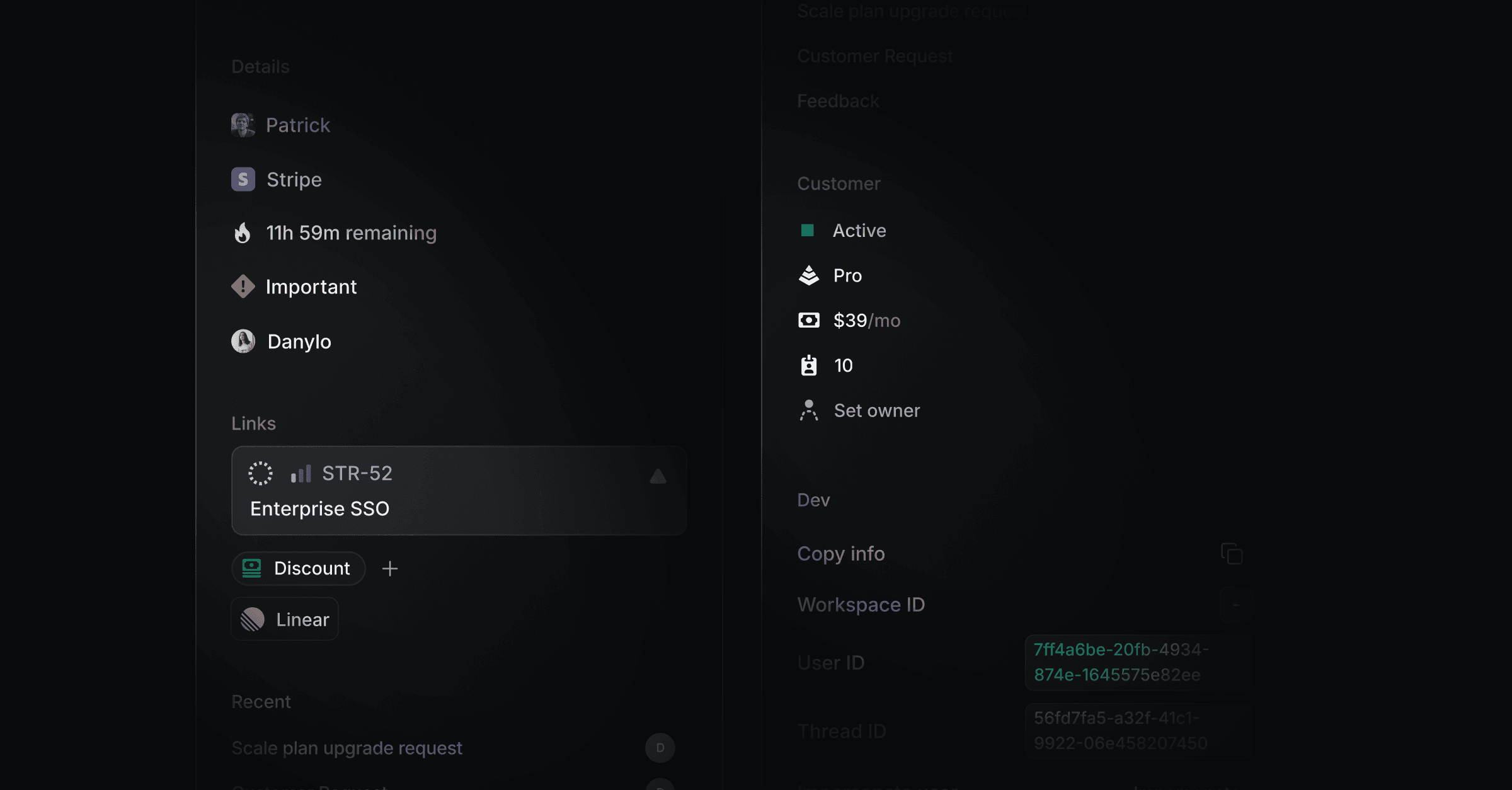
Display custom data for each company or person in each thread. Display things like their pricing tier, usage, an impersonation button, activation milestones and more to enable an excellent and fast support experience for your customers.
How it works
In your Custom Data settings you specify the endpoint that returns the JSON data of your components. This handler also takes care of fetching and parsing data to be represented. You can also provide headers optionally when creating a Custom Data.
The specified endpoint can handle complex data and integrate multiple data sources. In the end it is important that it returns your customized components structure. The following shows an example using NextJS.
1. Create function
Create the function that serves the request under e.g. pages/api/sidebar/section.ts.
export default async function handler(req: NextApiRequest,
  res: NextApiResponse) {

  return res.status(200).json({
    components: [
      ... // Components structure
    ]
  })
}
2. Integrate data sources
Integrate data sources and fetch all data you want e.g. Stripe, Prisma, etc.
export default async function handler(req: NextApiRequest,
  res: NextApiResponse) {
  // Use emailconst email = (req.body as { email: string; threadId: string }).email;

  // Fetch for customer dataconst customer = await prisma.customer.findUnique({
    where: {
      email,
    },
  });

  // Get subscription from customerconst { items } = await stripe.subscriptions.retrieve(
    customer.subscriptionId
  );

  // Take priceId from first subscriptionconst priceId = items.data[0]?.price.id;

  return res.status(200).json({
    components: [
      {
        // Components structure
        type: "row",
        left: [
          {
            type: "text",
            color: "normal",
            size: "m",
            text: "Current price",
          },
        ],
        right: [
          {
            type: "text",
            color: "muted",
            size: "s",
            text: priceId,
          },
        ],
      },
    ],
  });
}
Request Body
The request body contains:
threadId:
stringemail:
string
Back on the Thread you will find a new section with the title and the data.
Components
We provide you with a set of components including text and button to help you build your custom data integration. Each component needs to be included in a row which is separated by a left and right section for proper vertical and horizontal layout. Choose the attributes you want to apply and add them into a JSON response from your endpoint.
Row
Type | Attributes |
|---|---|
Row |
|
{
  type: "row",
	left: [
		{ type: "text", color: "normal", size: "m", text: "Threads created" },
		{ type: "text", color: "muted", size: "s", text: "In the last 2 weeks" },
	],
	right: [{ type: "badge", color: "green", text: "25 of 100" }],
}
Text
Type | Attributes |
|---|---|
Text |
|
{
  type: "text",
  color: "normal | muted",
  size: "s | m | l",
  text: "Threads created"
}Badge
Type | Attributes |
|---|---|
Badge |
|
{
  type: "badge",
  color: "green | gray",
  text: "25 of 100"
}
Spacer
Type | Attributes |
|---|---|
Spacer |
|
{
  type: "spacer",
  size: "s | m | l"
}LinkButtonType | Attributes |
|---|---|
LinkButton |
|
{
  type: "linkButton",
  label: "View usage",
  url: "https://google.com"
}
CopyButton
Type | Attributes |
|---|---|
CopyButton |
|
{
  type: "copyButton",
  value: `https://productlane.com/threads/${id}`,
  tooltip: "Copy Productlane thread link"
}
Full example
One full example might look like the following. You need to return this structure from your defined webhook/endpoint in order to be rendered as Custom Sidebar Cards.
const components = [
  {
    type: "row",
    left: [
      { type: "text", color: "normal", size: "m", text: "Threads created" },
      { type: "text", color: "muted", size: "s", text: "In the last 2 weeks" },
    ],
    right: [{ type: "badge", color: "green", text: "25 of 100" }],
  },
  { type: "spacer", size: "m" },
  {
    type: "row",
    left: [{ type: "text", color: "muted", size: "s", text: "MRR" }],
    right: [{ type: "text", color: "normal", size: "m", text: "149" }],
  },
  { type: "spacer", size: "m" },
  {
    type: "row",
    left: [{ type: "text", color: "muted", size: "s", text: "ARR" }],
    right: [{ type: "text", color: "normal", size: "m", text: "1.788" }],
  },
  { type: "spacer", size: "m" },
  { type: "linkButton", label: "View usage", url: "https://google.com" },
];Was this helpful?